DEUTSCHE TELEKOM
The Deutsche Telekom is the German telecommunications company and one of the largest telecommunications provider in Europe. Telekom offers customers a fixed network, mobile communications, and IPTV all from a single source.Telekom brings together all the elements of internet applications so that consumers can:
• can download films from the Web or watch soccer games on our mobile phones on the go
• use the mobile voice remote to navigate entertainment content at home
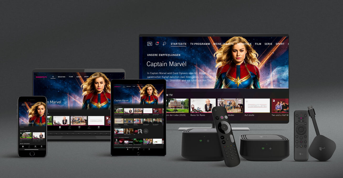
Image from Deutsche Telekom
01
MY ROLE
As a UX designer I worked alongside with external designers, product owner, business analyst and engineers. We get an overall feedback from our users and stakeholders to identify areas of improvements, see if patterns we used are intuitive enough.
02
THE CHALLENGES
I was excited as this was one first design project with the magentaTV team. As Deutsche Telekom has established its brand and interfaces, the team is mindful of finding a working solution that is acceptable to all the parties. Our challenge was to keep the design invisible, the user flow and interaction simple and seamless.
03
USER FEEDBACK TAKEAWAY
We created the user flow and collected feedback from the users and stakeholders.Most people had the following pain points:
• The interaction on the voice setting can be more intuitive.• It was not instinctively obvious to search through the speech bubbles.• It was confusing to have two buttons Back & Cancel twice in the same screen.• User would need more information while filtering the number of messages.
Together with other designer we identified a few UX gaps:
• The current voice history worked OK but lacked the experience users expect in a modern App• Noise• Users get confused with the selection option• Context and relevancy
04
TAKEAWAY
Together with other designers we identified a few UX gaps:
• The current voice history worked OK but lacked the experience users expect in a modern App• Noise• Users get confused with the selection option• Context and relevancy
05
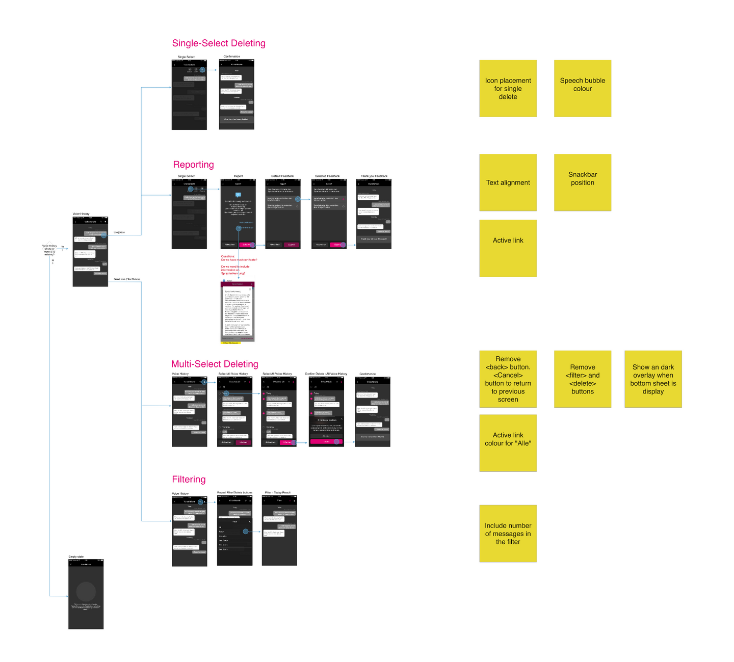
WIREFRAME & PROTOTYPE
DESIGN POLISHED
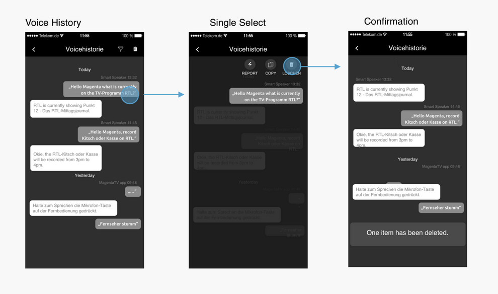
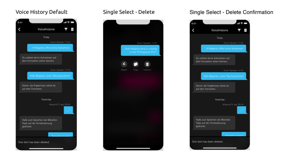
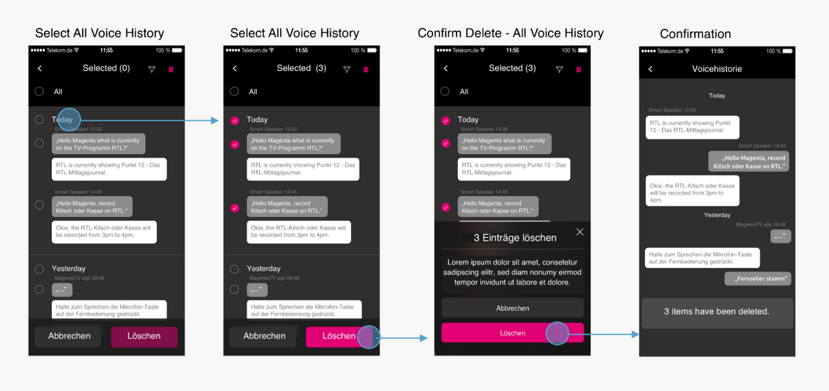
Voice history - Single select
1. Update of colour to the speech bubble to differentiate receiver and sender.
2. When <Delete> is tapped, selected item is removed and a confirmation snackbar is shown.
We created the prototype in high-fidelity due to the tight timeline.After a better understanding of user goals and behaviours, we have listed some key features of the app in order to create a prototype.
Deleting item(s) in the voice history• Separate single and multi-selected items with different interaction and behaviour• Bring visibility and prompt to the actions user has to perform• Update of colour to the speech bubble to differentiate receiver and sender
| About | Colour | Use |
|---|---|---|
| Primary colour: | Magenta | for primary buttons and checkboxes |
| Secondary colour: | Mid Grey | for speech bubbles of the device, cards, secondary buttons, circular buttons |
| Other colour: | Light Blue | for speech bubbles of the user |
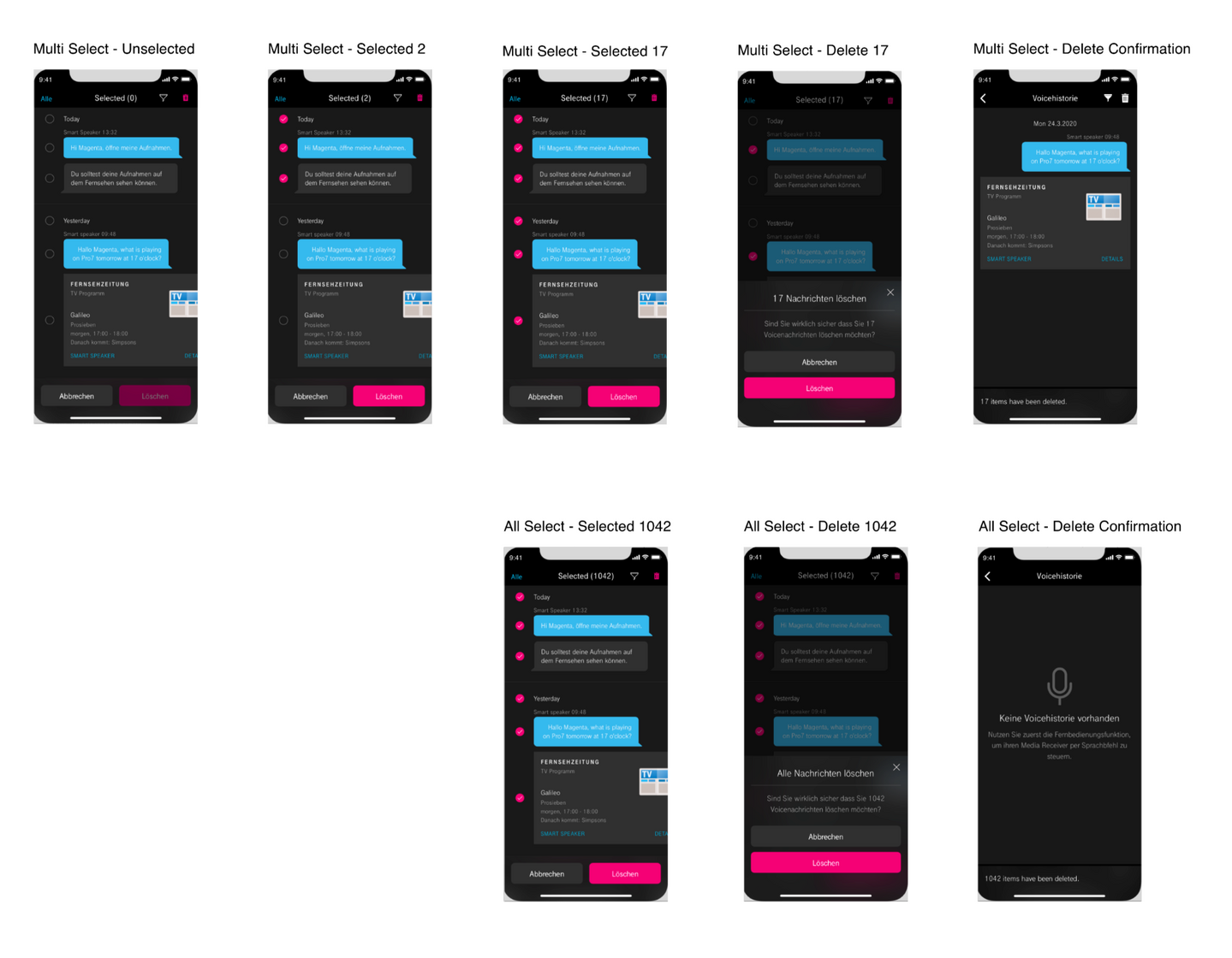
*1. User enters the edit mode when tapping the <delete> icon in the top menu. 2. Selecting a day will select all items from that day. Selecting "Alle" will select all items in the voice history. 3. When <delete> is tapped, a bottom sheet is shown. Tapping <cancel> will close the overlay and go back to the edit mode. 4. When tapping <delete> on the overlay, user returns back to the voice history page and a confirmation snackbar is shown.
Single-select items
BEFORE
AFTER
*1. User enters the edit mode when tapping the <delete> icon in the top menu. 2. Selecting a day will select all items from that day. Selecting "Alle" will select all items in the voice history. 3. When <delete> is tapped, a bottom sheet is shown. Tapping <cancel> will close the overlay and go back to the edit mode. 4. When tapping <delete> on the overlay, user returns back to the voice history page and a confirmation snackbar is shown.
Multi-select items
BEFORE
AFTER
07
UX TESTING
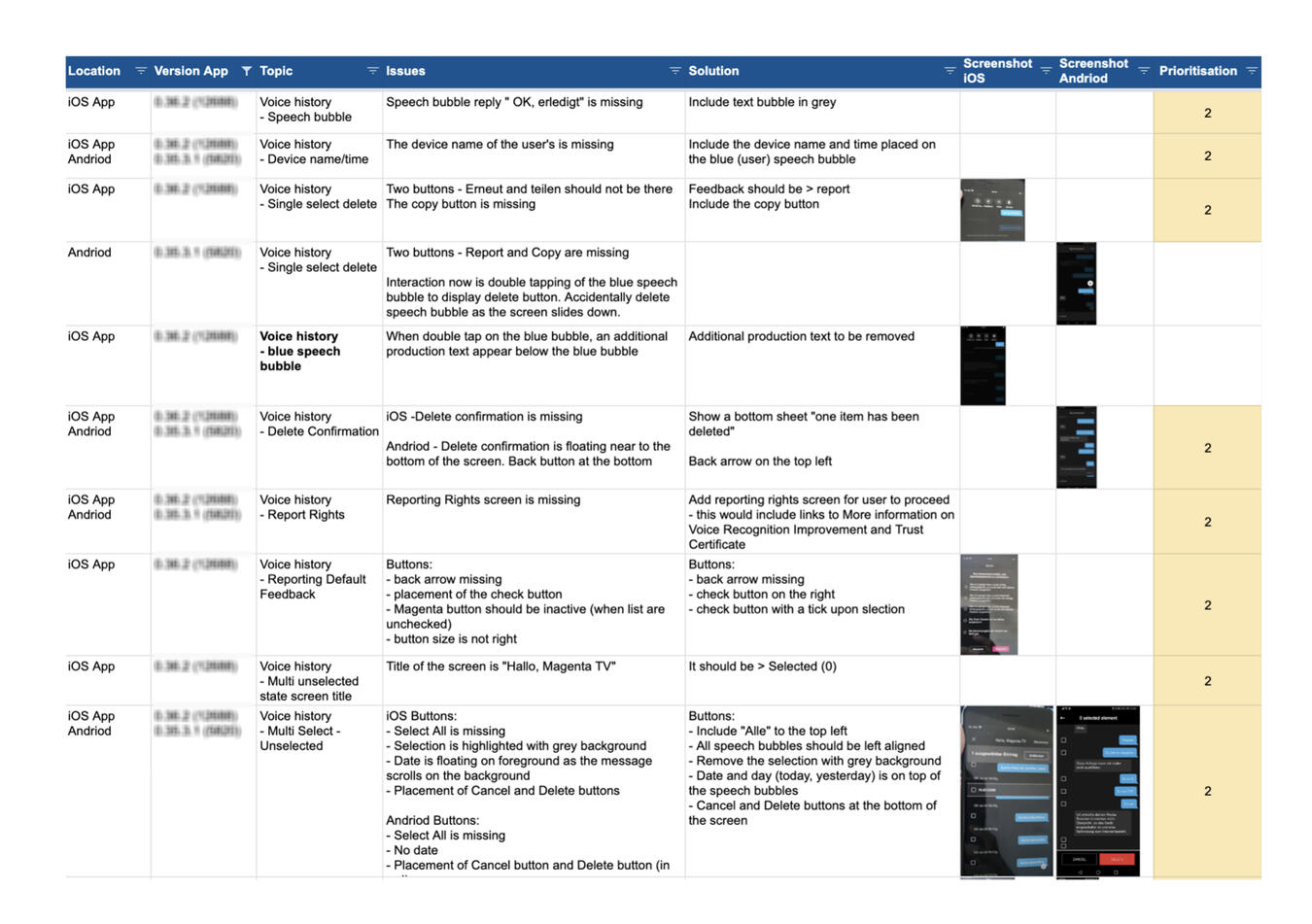
After updating the high-fidelity prototype, the next step was to test the functions in the test lab.Even though the design prototype is final at this point, I tested the features based on the actual functionality that was pre-defined for launch.The UX testing was done on both platforms documenting issues that may not be aligned to the solution. This helps the team to have an overview, gain better clarity of the developments and prioritize our design task accordingly.
08
FINDINGS
Some of the design did not look like the final design prototype.• A few buttons are not working as defined.• The interface are not align to the brand colours.• There were a few bugs on the filter selection.The findings and design improvement were shared with the team for further discussion and taken into the future sprints.
Cindy Lin-Tschoeke | UX, UI & Visual Designer | [email protected] | Last updated in 2022